Plan for a languagetool.org relaunch

Hi, I’d like to work on a redesign and relaunch of languagetool.org and I’d like to hear your ideas. Here are some reasons for having a relaunch:

  • The design was once clean, now it has become ugly due to too many small changes that were not done by a professional designer.
  • The language-specific sub pages have always been quite hidden. I think we should have a drop-down menu with all (maintained) languages that have their own sub page.
  • The homepage acts as the English page, but it lacks the detailed content that some sub pages (like the Russian one) have.
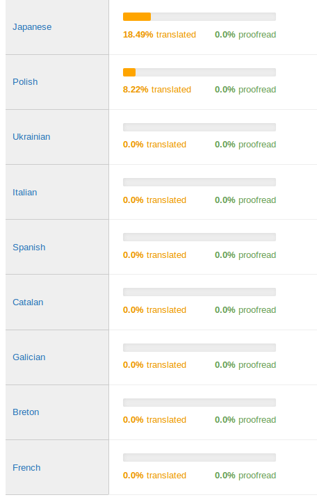
  • Our translation system is very messy.

I think we could have a redesign that keeps the basic idea: the text box is always the first thing on the page, for everything else you’ll need to scroll down or click the navigation. So my question to both users and contributors is: What issues do you see with languagetool.org that should be addressed with a relaunch/redesign?

I have no major complaints, and I think the site still has a clean look and feel to it overall. Three minor ideas for now:

  • Remove the “Home” link from the top of the page. As far as I see, its functionality only duplicates what happens when users click the logo.
  • Remove the text “LanguageTool identifies many grammatical and stylistic issues that a simple spell checker cannot detect.” under the text field. The sentence is a good summary of what LT does, and I wouldn’t throw it away for good. But it looks misplaced there, and I believe what it says is already implicit in the description “LanguageTool is a proof­reading service for…”
  • Maybe even the text “LanguageTool is a proof­reading service for…” is unnecessary for most users.
1 Like

Perhaps we could move those texts to an about-page for those who want to know.

The only major issue in my opinion is the demo text. It is interesting for new users but not for regular ones. And it is too hard to get rid of, especially on a mobile device (long touch in box, mark all, delete, then enter the text). My suggestions:

  1. Add a delete button like that on languagetoolplus.com. Also add a “Show demo text” button.
  2. (not important) Set a cookie. If the user is there for the first time, show the demo text. If not, don’t show it.
  3. Enhance mobile design. At the moment, there is a big white space at the right that the user might accidentally scroll into. Ad banners reach into it. Also, some content is missing (Facebook button for example). So either a separate mobile website or a well-adjusted responsive web design.
  4. If highlighted text is clicked on a mobile device, the keyboard should not open (or, if already open, disappear), because it might obscure the suggestions.
  5. Maybe also add a paste-button? Also especially for mobile devices, because long touch does take more time.

Well, I guess that’s enough. Sorry. :blush:

1 Like

When I look at this forum page now, I notice that almost all the navigational links are hidden away under the so-called “hamburger button” (the button left of the user avatar). Maybe that is how it can be organized.

I do not agree. Text is easier to understand than a logo.

If you use only a logo, make sure that it has ‘alt’ text for accessibility.

Ideally, do not show advertisements. They make the website look cheap and nasty.

The LT icon does 2 different things. On the Forum, it opens forum.languagetool.org, but on the languagetool.org pages, it links to languagetool.org. Use 2 different icons, or make the link always to the LT home page.

Simplify the visual appearance. For example, for link text, we have:
Black text, no underline
Blue text, no underline
Blue text, underlined
Light grey text, no underline
Light Grey underlined text on a dark grey background
Light Grey underlined text on a white background
Different colours and text sizes for clickable buttons

On the home page, remove ‘Add to Firefox free, no sign up required’, because the top navigation has ‘Add to Firefox’. Aside: why is there an emphasis on Firefox? Why not Google Docs or Chrome? Possibly, remove the link.

Possibly, remove the Download and Pricing sections from the LT home page. Merge that information into ‘Comparison of LanguageTool Editions’ (LanguageTool - Online Grammar, Style & Spell Checker). Then, all information about all editions/versions is in one place. From that page, a user can download the standalone versions, or buy a premium service.

On ‘Comparison of LanguageTool Editions’, clarify the ‘Works offline’ line: the red cross implies ‘no’, but the related text implies ‘yes’ (text is sent to languagetool.org…). And for the stand-alone versions, ‘yes, no text sent over internet’.

On the Forum (https://forum.languagetool.org/), add a note that says the page is for discussions. To report a bug, use Issues · languagetool-org/languagetool · GitHub

On Issues · languagetool-org/languagetool · GitHub, if possible, add a note that says for discussions, use the Forum.

Thanks for the detailed feedback.

Firefox users get the Firefox add-on link, Chrome users get the chrome add-on link.

I think we need a special page for the LanguageTool proofreader for Android.
It works as a service, and users do not understand how to use it. Many such reviews on the LanguageTool proofreader page in the Android market.

This is not really an official service from languagetool.org - but if someone prepares such a page, we could have it on languagetool.org anyway.

Possibly, Mojito would be useful:

(Sorry for the late reply. Learned about Mojito only today.)

I think with http://webtranslateit.com we have now found a good solution.

Hi, these languages don’t have a complete translation yet:

That means they will appear in the menu of the new languagetool.org to be published real soon now, but the content will actually not be translated. Instead, the English strings will be shown. Please let me know if you’d like to work an any of these languages and I’ll give you an account to do so.

I can’t say that I like the design of the new page :frowning:

Some remarks, which are of course debatable and a matter of taste:

  • In the localized page (LanguageTool - Correcteur d’orthographe, de grammaire et de style en ligne for example), we now have buttons “V” to expand the text. Expanding a section automatically closes other sections. I find this irritating. I’d prefer to see the full page content at once. Closing sections automatically is especially useless since the rest of the page is now very verbose compared to those sections that get closed (see next points)
  • colors don’t go well with each other. Purple background with a red button “Premium” next to a cyan button “Check text”, next to a purple button (to erase text) looks unappealing to me and inconsistent.
  • The section about pricing is very verbose. I would have preferred a discrete link. There is already such a button “Pricing” at the top of the page which would have been enough if it lead to a different page. I don’t mind that LT now has paid services, but being so verbose on the main page is trying too hard to sell something. Trying too hard backfires and turns people off I suspect.
  • The section about all add-ons is much more verbose that it used to be on the older page with orange download buttons organized in columns. Despite being verbose, it does not have all add ons. The add-on download pages of Grammalecte (French grammar checker) looks more appealing to me. See sections “Télécharger” (= download) at https://www.dicollecte.org/
  • The review section is also a tad verbose and the automated animation can be annoying.
  • Icons of company that use LT are quite large.
  • The section about social network (twitter, …) does not have to be so verbose. Just small icons would be enough.
  • It’s not obvious anymore from the main page that LT is free software. If I did not know, I would not have guessed at first sight.

I hope I don’t sound too negative and that some of these remarks can help to make the site look nicer.

I’ve just noticed that the add-ons no longer report the version.
I believe this should still be reported to prevent downloading of a version one already has.

Thanks for the feedback. I was not sure about this section feature with only one section being open. I have removed it now. The colors and fonts will be fixed by our designer.

The old approach was problematic because there was not enough space to add some descriptions. The old homepage also only featured the “official” add-ons, i.e. those in our github repo.

I’ll post here once our designer has improved the page.

I have added that again, thanks.

The new page is now at GitHub - languagetool-org/languagetool-website-2018: OUTDATED, do not use anymore - please don’t use the old repo (https://github.com/languagetool-org/languagetool-website anymore).

The sub pages http://languagetool.org/XX/ are at resources/views/shared/qa/XX.blade.php. They contain a section that is specific to that language and that’s not just a translation. If you make changes, let me know, the automatic git update isn’t active yet.

That was one of my first thoughts.